“Mind-Blowing Discovery: What You Never Noticed About the Iconic Vans Logo!”

Have you ever glanced at the Vans logo and thought, “Wow, that’s so iconic”? Well, hold onto your sneakers because it turns out there’s more to that simple design than meets the eye! Most of us have been strutting around in our Vans, totally oblivious that the bold lettering actually has a mathematical twist. Yes, you read that right! That oh-so-familiar logo has been secretly resembling the square root symbol all along, and it’s a revelation that had the internet buzzing a few years back. So, what’s the scoop? Let’s dive into this funky logo’s journey and discover how something so familiar can still surprise us! You won’t want to miss this intriguing connection—after all, who knew wearing Vans could be a math lesson in disguise? LEARN MORE.
It turns out that the meaning behind the Vans logo has been there all along, but most of us have never realised.
I mean, we have all become accustomed to the simple, yet bold design of the logo.
The black and white image features the word ‘VANS’, in a blocky styled text, as the V extends as a horizontal line over the rest of the letters.
This distinctive feature became the subject of a tweet from Today Years Old back in 2018.
Shortly after, fans were quick to realise that the ‘V’ in the logo is reminiscent of a mathematical symbol.
“I was today years old when I realised the Vans logo is the square root of answer,” the tweet, which has now got over 1,000 likes, read.
But that’s not all.

(Christian Vierig/Getty Images)
Then with the help of a calculator, internet users have shown that the logo for the shoe brand is the same as the equation for ‘the square root of answer’. On a calculator, this appears as ‘√ANS’.
Responding to the realisation online, one astounded X user wrote: ‘once you see it, you can’t unsee it’.
Another mind-blown person commented: “Noooooooooooooo.”
A third has gone as far as to create a whole scenario involving Vans and the maths equation, writing on Reddit: “So this is the scenario I thought up when I realized this.
“A guy walks into a Vans store. The guy at the counter asks him what his favourite type of shoe is, and he blatantly says “Vans!” The guy at the counter can then say ‘Radical Answer, bro’ and not sound stupid.”
It’s clear they’ve given it a lot of thought, but unfortunately the likeness to the equation doesn’t actually appear to be intentional.
According to the Logo My Way blog, the familiar Vans logo stems back to the company’s early days following its inception in 1966.
The original version of the logo was created by the son of the one of the brand’s founders, who actually originally intended to paint it on a skateboard. However, when his father James Van Doren saw the graphic, he decided to put it on the heel of one of the company’s shoe designs.
That marked the start of Vans’ large scale manufacturing of skateboarding footwear; a decision which has proved successful to this day. With the long line stretching out over the final three letters, the Vans logo has become key to the company’s visual brand identity, allowing customers to easily identify the shoes.
If I’m honest, I’m glad the logo doesn’t seem to be intentionally rooted in maths. I don’t want my footwear to feel like a school lesson.

RIVER OF GOODS LED Boho Ceiling Fan with Hand Woven Brown/Natural Rope - Macrame Knot Work and Hemp Rope Style Eclectic Cottage Decor - 52" L x 52" W - Rich Barnwood/Light Driftwood Fan Blades
$188.99 (as of October 27, 2025 18:42 GMT +00:00 - More infoProduct prices and availability are accurate as of the date/time indicated and are subject to change. Any price and availability information displayed on [relevant Amazon Site(s), as applicable] at the time of purchase will apply to the purchase of this product.)
The Door Balancer Eliminates The Need for Door Props, Door Stops and Door Wedges
$7.99 (as of October 27, 2025 18:42 GMT +00:00 - More infoProduct prices and availability are accurate as of the date/time indicated and are subject to change. Any price and availability information displayed on [relevant Amazon Site(s), as applicable] at the time of purchase will apply to the purchase of this product.)
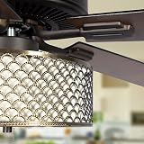
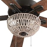
RIVER OF GOODS Farmhouse LED Ceiling Fan - 52" L x 52" W - Metal Caged Fixture - Rich Barnwood/Light Driftwood Fan Blades
(as of October 27, 2025 18:42 GMT +00:00 - More infoProduct prices and availability are accurate as of the date/time indicated and are subject to change. Any price and availability information displayed on [relevant Amazon Site(s), as applicable] at the time of purchase will apply to the purchase of this product.)
Kinsa Smart,Fever, Digital Medical Baby, Kid and Adult Termometro - Accurate, Fast, FDA Cleared Thermometer for Oral, Armpit or Rectal Temperature Reading - QuickCare
$24.98 (as of October 27, 2025 18:42 GMT +00:00 - More infoProduct prices and availability are accurate as of the date/time indicated and are subject to change. Any price and availability information displayed on [relevant Amazon Site(s), as applicable] at the time of purchase will apply to the purchase of this product.)